
")
Divi has long been a powerhouse for building beautiful websites. Specialty Sections extended Divi’s layout capabilities for years by enabling complex, nested column structures that Regular Sections couldn’t handle. But this approach came with its complexity and limitations, tied deeply to Divi’s old shortcode framework.
Now, Divi 5 comes with Nested Rows — a native feature that lets you place rows inside columns anywhere, within Regular Sections. This feature removes previous constraints and unifies layout building under a single, flexible section type. With Nested Rows, you can build the same complex, asymmetrical layouts that Specialty Sections allow, but more intuitively.
In this post, we will discuss the move away from specialty sections and how Nested Rows and Divi 5’s redesigned layout system provide a better way to create complex layouts. Divi’s future is here, and it’s simpler, more flexible, and built for unlimited creativity.
Subscribe To Our Youtube Channel
👉 Divi 5 is ready to be used on new websites today.
A Retrospective Of Specialty Sections
Specialty Sections were introduced in Divi (2014) to address the limitations of Regular Sections. They allowed for more complex column structures, including sidebars and asymmetrical layouts, which were impossible with regular sections.
Divi’s shortcode-based framework fundamentally limited layout complexity by restricting nesting depth and introducing performance bottlenecks. Complex nested layouts were hard to build and prone to rendering issues, so they weren’t possible until Specialty Sections.
However, they introduced additional complexity because Specialty Sections were their own thing (notice the extra Column padding and CSS options for these Sections). These weren’t bad, but they definitely behaved differently than Regular Sections, Rows, and Columns.

Specialty Sections added extra padding and CSS class/id fields that were necessary but incongruent with the rest of the Builder options.
Specialty Sections enabled pseudo-nested column structures by bending the shortcode rules, creating what wasn’t possible in Regular Sections.
Wouldn’t it be nice if Regular Sections were powerful enough to do what you need of them?
Nested Rows And A Better Way To Build Pages
With Divi 5, Nested Rows officially allow placing Rows (and their Columns) inside other Rows and Columns. This means you can create deeply nested layouts with unlimited columns and rows inside each other. It eliminates the need for Specialty Sections.
This new feature also added Sizing options to Columns, meaning there is a consistent way to size and style all container elements.
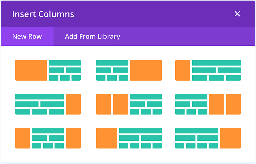
How To Easily Recreate A Specialty Section With Nested Rows
The Scooter Rental Layout Pack (particularly the Homepage’s hero section) uses a Specialty Section to position key elements. However, instead of using a Specialty Section with its unique settings, we will use Nested Rows to achieve a similar effect.

Note: Divi 5 currently has Specialty Sections, but they will eventually be deprecated (but they will still work and be duplicable on pages where they currently exist).
Add a Standard Section to your page and set the Background Color to black (if you imported the Layout to your page, you have the dot-circle image to use as a background image with a Top Center position and Actual Size).

Set the Section’s width and max width to 100%.

Ensure the Row inside the Section has a two-column structure and a 3/5 + 2/5 split. Also, set the Row’s width and max width to 100%.

If you want to use other new features, add only a single Column with two Module Groups inside. You’ll use Sizing options for the Groups instead of relying on Divi’s default Column structures.
The left column will house the more complicated side (in terms of Modules), and the right Column will house the big featured image.
We’ll add all our Modules to get a sense of the layout. That includes a Heading or Text Module first, then a Nested Row (two columns of equal width), an Image Module in the left Column, and a Text Module and a Button Module in the right Column. Back up to the Parent Row, in the Right Column, add one Image Module.

We’ll only replicate the spacing/sizing on desktop to illustrate how we can recreate the Specialty Section using Nested Rows. Go ahead and add the content and images (again, images are available when importing the Layout into a page on your site). You can also modify the text and color styles to match as you see fit. The main image in the right Column should be applied as the Background Image, and the Image Module with the accent image that we’ll get to later.

For the left Column of the Row directly under the Section, add ~10% left padding to space it off from the left side (doing it this way means you’ll need to resize things for each breakpoint).
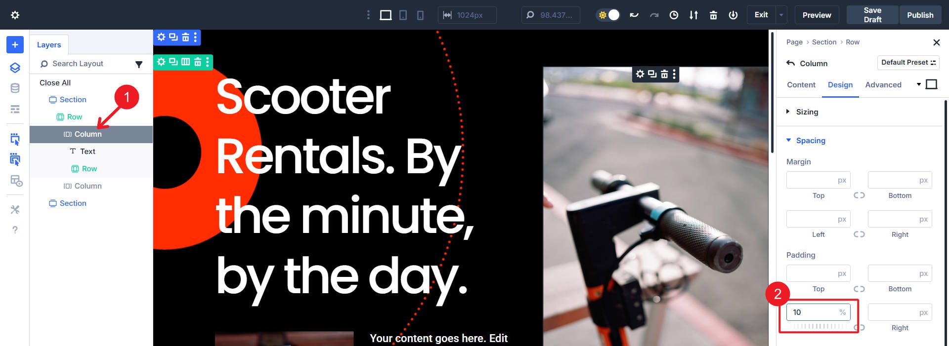
Now, open the settings of the right column directly under the parent row. Use a Column Background Image.
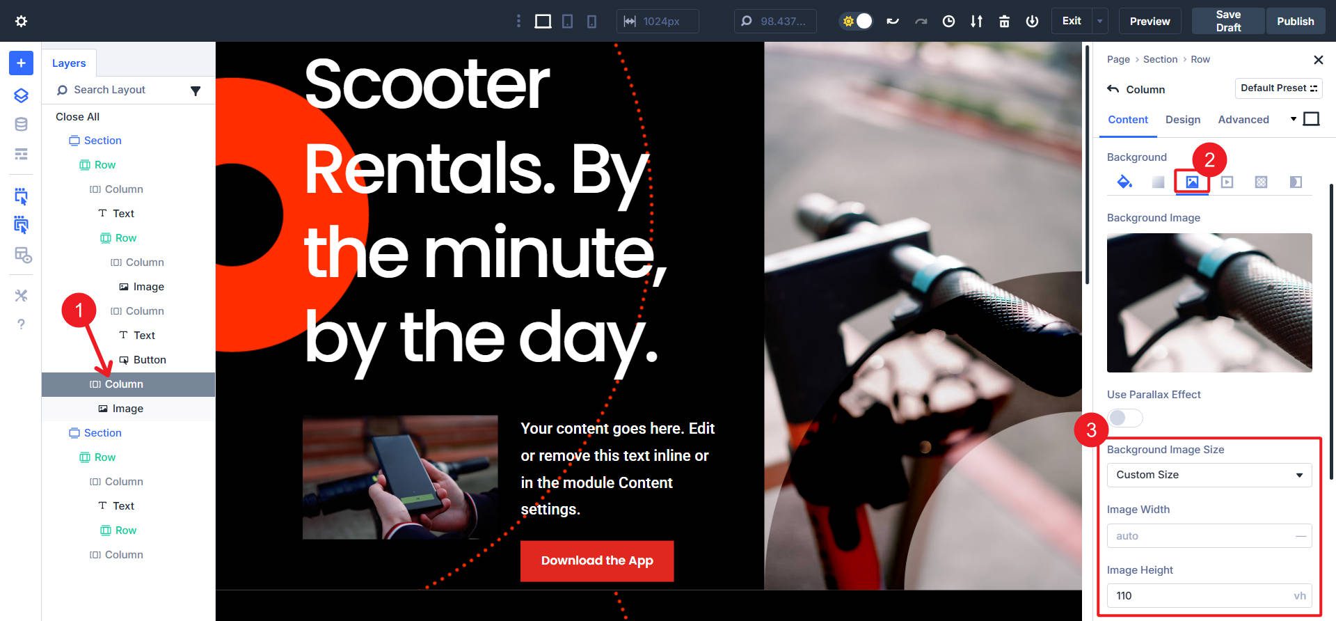
The Image Module inside this column should have a Filter > Blend > Overlay set to it. In Advanced > Position, the image is absolutely positioned and anchored to the Bottom Left.

And that is nearly it for the recreation of the Specialty Section (on Desktop). Since we used the preset Column structure (3/5 + 2/5 Columns), Divi has some default sizing and positioning at various breakpoints that need to be addressed. You could avoid this by using a single Parent Column but Module Groups to hold the content for this Section’s left and right sides.
But at least at this point, you know that it is possible to Nest Rows and recreate Specialty Sections.
Stepping Into A New Future
Divi 5 is close to a Beta release, but we have already made significant efforts to overhaul Divi’s Design System.
- Flexbox Layouts (Coming Soon): Will offer more control over alignment and distribution of space within rows.
- Nested Rows: Endless nesting of Row and Column structures to create quite a bit of complexity with the native Float-based Row system.
- Advanced Column Sizing: Added missing Sizing controls for Column widths and heights.
- Module Groups: Enables grouping of Modules for easier management and styling.
- Design Variables: Define and reuse global variables (colors, fonts, spacing, images, text) across all elements and fields.
- Relative Colors with HSL (Coming Soon): Dynamic, brand-consistent color control based on hue, saturation, and lightness.
These features are all part of Divi’s reinvention and are pivotal to its comeback. We are proving that the foundation we built over the last two years was worth it. We can build features that weren’t possible on D4, and we are making each in a matter of weeks.
👉 Divi 5 is ready to be used on new websites today.


I am still confused about just when Divi 5 is scheduled to be released, proper. We are talking a year from now, right?
Divi 5 Beta is a just a few months away – this will be the version we would be able to widely recommend for both new websites and Divi 4 conversions. The final version is aspirationally expected by the end of the year.
Hope this helps! 👍